3. 1992-1993 Home Shirt (Adidas)
Historical context: The season of absolute glory
The 1992-93 home jersey is probably the most iconic in Olympique de Marseille’s history. This design accompanied the team to its greatest triumph: the victory in the Champions League final against AC Milan, making OM the first (and so far only) French club to lift this prestigious trophy.
Under the direction of Raymond Goethals, and thanks to legendary players like Basile Boli, Didier Deschamps, and Rudi Völler, OM left its indelible mark on this season.
Design and aesthetics
This jersey represents elegance and simplicity, with subtle details that make it a timeless piece. Here are its main features:
- Main color white : Reflecting the purity and tradition of OM.
- Blue Adidas stripes : Discreetly placed on the shoulders to add a dynamic touch while remaining understated.
- Sky blue V-neck : Comfortable and aesthetic, it balances the design.
- Sponsor Panasonic : In blue, it fits perfectly without disturbing the visual harmony.
- Embroidered Adidas logo : Highlighting the quality of manufacture.
Highlights
This jersey is inseparable from some of the greatest moments in the club's history:
-
Victory in the Champions League :
- In the final against AC Milan, Basile Boli scored with a header from a corner taken by Abedi Pelé, giving OM the victory (1-0). This moment has remained etched in the collective memory of the supporters.
-
Domination in Ligue 1 :
- OM also shone in the championship, despite the controversies that followed this season.
-
A legendary team :
- The jersey was worn by iconic players such as Alen Bokšić, Marcel Desailly, and Fabien Barthez, all essential to this historic triumph.
Impact on supporters
- Symbol of Marseille pride : This jersey is a trophy in itself, representing the pinnacle of European football.
- Lasting popularity : Even decades later, it remains one of the most sought-after jerseys by collectors.
- A piece of history : Every fan who owns it claims a direct connection to that glorious period.
Interesting anecdotes
- This jersey is often compared to that of Real Madrid for its simplicity and class, highlighting the elegance it projects.
- It is frequently reissued by Adidas or other licensed brands, but the original models from the 1990s remain the most popular.
.jpg)
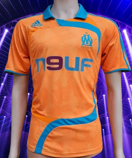
4. Third jersey 2007-2008 (Adidas)
Historical context: A controversial jersey for a European season
The third jersey of the 2007-2008 season divided fans with its bright orange color. Designed for European competitions, this jersey was worn during OM's UEFA Cup campaign. Although it attracted criticism for its departure from traditional colors, it made an impression with its audacity.
This season saw OM reach the round of 16 of the UEFA Cup and finish third in Ligue 1, confirming their position among the best French teams.
Design and aesthetics
This jersey is anything but conventional, with bold visual choices:
- Neon orange color : A complete break from the club's usual tones, designed to be highly visible on the pitch.
- White Adidas stripes : Contrasting with orange for a balanced effect.
- Black round neck : Offering sharp contrast and a modern look.
- Sponsor New : In white, it fits well into the design, although some fans found it too discreet.
Highlights
-
European campaign :
- This jersey was worn in some intense UEFA Cup matches, although it was not enough to take the team further in the competition.
-
In Ligue 1 :
- Players like Samir Nasri and Djibril Cisse wore this jersey in memorable matches, cementing their place in the team.
Impact on supporters
- Initial reviews : Many fans were disconcerted by the bright colour, judging it too far removed from OM's visual identity.
- Reassessment over time : This jersey is now seen as a bold and avant-garde piece, and is sought after by collectors because of its uniqueness.
- Symbolism : Although it was worn during a less glorious period, it embodies a desire for innovation and stylistic exploration.
Interesting anecdotes
- This jersey is often nicknamed "The Orange Jersey" among fans, a nickname that reflects its iconic character.
- It inspired discussions about the need to push the boundaries of design while respecting the club's identity.
5. Home jersey 2020-2021 (Puma)
Historical context: An attempt at modernity with a local touch
When Puma took over as official kit supplier to Olympique de Marseille in 2018, they brought a touch of modernity and innovation to their jersey designs. The 2020-21 home jersey is one of the first to reflect this new direction. Inspired by local architecture, including Marseille’s iconic mosaics and structures, this jersey is a fusion of tradition and contemporaneity.
This season has been marked by mixed performances, with OM finishing fifth in Ligue 1 under André Villas-Boas. However, this jersey has become a talking point for its bold attempt to reflect Marseille culture in its design.
Design and aesthetics
The 2020-2021 home jersey is a modern reinterpretation of the club's classic colours. Here are its features:
- Main color white : Remaining faithful to the club's tradition, but enhanced with contemporary details.
- Blue geometric patterns : Inspired by mosaics found throughout Marseille, these subtle patterns add visual depth to the design.
- Light blue V-neck : Elegant and minimalist, it harmoniously complements the patterns.
- Puma Logo : Placed on the right side of the chest, in light blue, for a modern appearance.
- Sponsor Uber Eats : Although criticized by some for its size and contrast, it is a central element of the design.
Highlights
-
Champions League matches :
- This jersey was worn during the group stage of the Champions League. Although OM finished last in their group, the jersey was noted for its unique appearance.
-
Performances in Ligue 1 :
- Although the season was tumultuous, this jersey saw players like Dimitri Payet and Florian Thauvin shine in some memorable matches.
-
A local tribute :
- The design marked Puma's attempt to connect the club with its local environment, a choice welcomed by fans and the media.
Impact on supporters
- Mixed initial reception : Some fans loved the homage to Marseille, while others criticized the complexity of the patterns which could distract from the overall design.
- Growing appreciation : Over time, many fans have recognized Puma's effort to incorporate local cultural elements into a sports jersey.
- Collectors : This jersey quickly became popular among lovers of unique and innovative pieces.
Interesting anecdotes
- The mosaic patterns of the jersey were directly inspired by the tiles that can be found in some of Marseille's historic buildings, including the Basilica of Notre-Dame de la Garde.
- This jersey marked a turning point for Puma, which continued to experiment with bold designs for the clubs it sponsored.
.jpg)
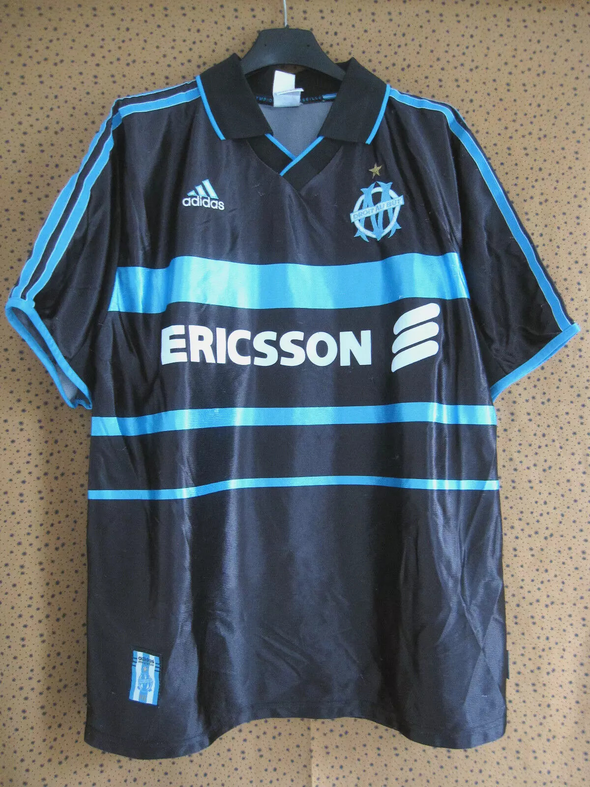
6. 1999-2000 Away Shirt (Adidas)
Historical context: A year back in Europe
The away jersey of the 1999-2000 season is one of the most appreciated designs for its simplicity and elegance. As OM sought to regain its place among the best European clubs after years of difficulties, this navy blue jersey symbolized the seriousness and solidity found in the club.
Under Bernard Casoni, Marseille finished fourth in Ligue 1, qualifying for the UEFA Cup.
Design and aesthetics
This jersey embodies the timeless style of the 1990s. Here are its highlights:
- Main color navy blue : Symbolizing stability and depth, perfect for away games.
- White Adidas stripes : Subtly placed on the shoulders, they provide a harmonious contrast.
- Classic crew neck : Minimalist, it fits perfectly with the rest of the design.
- Embroidered Adidas logo : On the right chest, it reflects attention to detail.
- Sponsor Ericsson : Affixed in white, it goes well with the general color palette.
Highlights
-
Return to the UEFA Cup :
- This jersey was worn during matches in Europe, marking a promising return for OM to the continental scene.
-
National performances :
- OM, although not winning any titles this season, showed signs of revival with players such as Robert Pirès and Florian Maurice.
Impact on supporters
- A favorite of purists : Fans of simple yet elegant designs consider this jersey to be one of the best of the Adidas era.
- Timeless aesthetics : Unlike some more daring jerseys, this one has stood the test of time, remaining appreciated for its sobriety.
- Sentimental value : This jersey is associated with a time when OM was slowly regaining its status as a major club.
Interesting anecdotes
- This jersey is often mentioned in discussions about "simple but effective" designs that have marked the history of football jerseys.
- It has inspired several modern replicas offered by Adidas and brands specializing in retro.
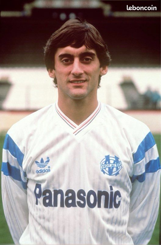
7. 1988-1989 Home Shirt (Adidas)
Historical context: The rise to dominance
The 1988-89 home jersey represents a pivotal period for Olympique de Marseille. Under the presidency of Bernard Tapie, OM began their rise to total domination of French football. This jersey is linked to a memorable season, where the club won the French championship, beginning a series of domestic titles that would define the glory of the 1990s.
Worn by iconic players like Jean-Pierre Papin and Éric Cantona, this jersey symbolises the start of a new era for OM.
Design and aesthetics
The design of this jersey embodies an elegant simplicity that remains etched in memories:
- Main color white : True to tradition, white represents purity and elegance.
- Adidas Blue Stripes : Positioned on the shoulders, they add a dynamic and recognizable touch of the era.
- Blue V-neck : Subtle and balanced, it perfectly complements the rest of the design.
- Embroidered Adidas logo : Located on the right chest, it reflects the attention to detail paid by the equipment manufacturer.
- Sponsor Panasonic : Placed in the center, it fits harmoniously into the composition of the jersey.
Highlights
-
Conquest of the French championship :
- This jersey was worn during OM's decisive championship victory, marking the beginning of their national domination.
-
Legendary Team :
- With players like Papin, who would win the Ballon d'Or a few years later, and Cantona, this jersey is associated with a team that redefined French football.
-
Back to Europe :
- Although OM did not win a European title this season, this jersey was seen in several notable matches in the European Champions Cup.
Impact on supporters
- Symbol of an era of success : This jersey is often cited as the start of a glorious period for OM.
- Timeless aesthetics : Its simple yet elegant design makes it a favorite of collectors and purists.
- Local pride : It reminds Marseille supporters of the years of domination and grandeur.
Interesting anecdotes
- This jersey is regularly used as a model for modern reissues offered by Adidas.
- It is often mentioned by fans as one of OM's most iconic jerseys before the 1990s era.
.jpg)
8. 2003-2004 Away Shirt (Adidas)
Historical context: The European revival
The 2003-2004 season saw OM return to the European stage. Worn during the campaign that took the club to the UEFA Cup final against Valencia, this dark blue away jersey embodied the club's renewed ambition. Although OM lost the final (2-0), this season allowed the club to regain respect in France and Europe.
Design and aesthetics
This jersey, designed by Adidas, stands out for its refinement:
- Main color dark blue : Evoking depth and determination, it gives an elegant and professional look.
- Golden touches : Gold details on the collar and sleeves add a touch of luxury.
- Gold Adidas stripes : Positioned on the shoulders, they reinforce the impression of prestige.
- Sponsor Neuf Telecom : In white, it contrasts effectively with the dark blue without overloading the design.
- Minimalist crew neck : Comfortable and discreet, it highlights the other visual elements.
Highlights
-
UEFA Cup campaign :
- This shirt was worn in the memorable victory against Newcastle United in the semi-final, with Didier Drogba scoring twice.
-
Individual performances :
- Drogba scored 11 goals in European competition in that shirt, cementing his reputation before his move to Chelsea.
-
Pride restored :
- Although the final against Valencia was disappointing, this jersey is associated with a period where OM showed that they could compete with the big European teams.
Impact on supporters
- A memorable season : This jersey recalls a time when OM thrilled its supporters in Europe.
- Drogba's popularity : This jersey is often sought after by fans for its association with Drogba, one of the most beloved players in the club's history.
- Collectibles : Due to its unique aesthetic and historical significance, this jersey is highly prized by collectors.
Interesting anecdotes
- This jersey is often nicknamed "the Drogba jersey" in homage to the impact he had during this season.
- Adidas created several variations based on this design, used by other clubs, but none had as much impact as OM's.
.jpg)
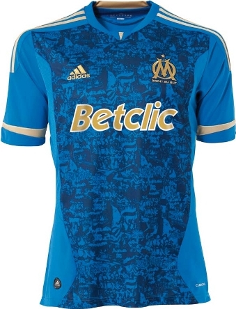
9. 2009-2010 Away Shirt (Adidas)
Historical context: The return of titles
The 2009-2010 season was synonymous with a renaissance for OM. Under Didier Deschamps, the team won the French championship for the first time since 1992 and also won the Coupe de la Ligue. The turquoise blue away jersey, worn in notable matches, became a symbol of this resurgence.
Design and aesthetics
This jersey is bold, both in its choice of colors and its modernity:
- Main color turquoise blue : Lively and bold, it reflects renewed energy.
- Black keys : Applied on the sleeves and collar for a clear contrast.
- Black Adidas stripes : Discreet, they fit in well with the overall design.
- Betclic Sponsor : In white, it harmonizes with the color palette.
Highlights
-
Successes in Ligue 1 :
- This jersey was worn during decisive matches which allowed OM to win the championship title.
-
Iconic players :
- Stars like Lucho González, Mamadou Niang and Steve Mandanda wore this jersey during this unforgettable season.
Impact on supporters
- A jersey synonymous with victory : This jersey is associated with a glorious season, marking the end of a long period of drought for the club.
- Bold aesthetics : Although unusual, this color was well received because of its association with historical successes.
.jpg)
10. Home jersey 2018-2019 (Puma)
Historical context: A new era with Puma
The 2018-2019 season marks the beginning of a new partnership between Olympique de Marseille and Puma, the German kit supplier, after several years under Adidas. This home jersey is the first fruit of this collaboration, and it aims to combine tradition and modernity. This season, although complicated sportingly (5th in Ligue 1), has seen a significant effort to strengthen the bond between the club and its fan base through marketing and design initiatives.
Design and aesthetics
The 2018-2019 home jersey stands out for its sobriety and its cultural references to the city of Marseille:
- Main color white : A sure value that reflects the club's tradition.
- Textured blue sleeves : Graphic patterns inspired by the waves of the Mediterranean, creating a subtle but powerful connection with local identity.
- White round neck : Simple and refined, it highlights the top of the swimsuit.
- Orange Sponsor : Placed in the center, it offers a visual contrast without clashing with the rest of the jersey.
- Puma Logo : In light blue, it sits on the right chest for a modern, minimalist touch.
Highlights
-
Ups and downs in Ligue 1 :
- Despite a promising start to the season, OM have had some inconsistent performances. This jersey has been worn in notable victories against teams like Dijon and Bordeaux, but also in frustrating defeats.
-
Europa League :
- This jersey was used during the group stage of the Europa League, although OM failed to advance in the competition.
-
A team in transition :
- Players like Florian Thauvin, Dimitri Payet, and Luiz Gustavo have worn this jersey, embodying a team rebuilding after losing the Europa League final in 2018.
Impact on supporters
- A generally positive reception : Supporters appreciated the tribute to Marseille with the sleeve patterns, although some considered the design too minimalist.
- Strong symbolism : As the first jersey of the Puma era, it represents a new beginning for the club.
- Growing appreciation : In retrospect, this jersey is seen as a successful attempt to reconcile tradition and modernity.
Interesting anecdotes
- The textured sleeves were inspired by the movements of the sea, reminiscent of Marseille's central square as a historic port city.
- This jersey has been used for several local advertising campaigns, strengthening the bond between the club and its fans.
%20om.jpg)
11. 2022-2023 Away Jersey (Puma)
Historical context: Sobriety and modernity
The 2022-2023 season is marked by a continued effort by Puma to reinvent OM jerseys while respecting the club’s heritage. This season’s away jersey, predominantly black, reflects a current trend in football jersey design: elegance and simplicity.
OM, under the direction of Igor Tudor, had a competitive season, finishing 3rd in Ligue 1 and participating in the Champions League. This jersey was used in several away matches, where it was praised for its refined appearance.
Design and aesthetics
The 2022-2023 away jersey is a perfect example of modern minimalism:
- Main color black : Elegant and professional, it gives an urban and aggressive style.
- Dark gray geometric patterns : Subtle, they recall Marseille architecture and add depth to the design.
- Touches of sky blue : Present on the collar and sleeves, they recall the traditional colors of the club.
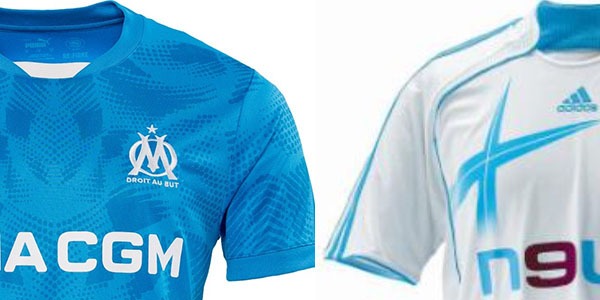
- Sponsor CMA CGM : In white, it stands out well without detracting from the clean look of the jersey.
- Puma Logo : In white, for a simple but effective contrast.
Highlights
-
Key matches in Ligue 1 :
- This jersey was worn in crucial away victories, notably against Lille and Rennes, consolidating OM's position at the top of the table.
-
Performance in the Champions League :
- Although OM were eliminated in the group stage, this jersey saw memorable clashes against teams like Tottenham Hotspur and Eintracht Frankfurt.
Impact on supporters
- A positive reception : Fans appreciated the sobriety and the "streetwear" side of this design, which can be worn easily on a daily basis.
- Marseille identity : The subtle patterns have been praised for their connection to the city of Marseille.
- Popularity among young people : The modern style particularly appealed to younger fans.
Interesting anecdotes
- This jersey was integrated into advertising campaigns focused on urban style, with photoshoots in emblematic places of Marseille such as the Vieux-Port and the Canebière.
- The choice of a black palette was seen as a nod to the modern alternate jerseys used by many of Europe's top clubs.
.jpg)